
RevSpring - Redesigning an enterprise healthcare website for admin staff
Reducing appointment rescheduling drop-offs by 32%
Project Type
B2B Enterprise, Healthcare UX, SaaS, Website & App Redesign
Team
1 UX Designer (Myself), 3 Engineers, 1 Project Manager, 1 Product Owner
Duration
8 months (Jan 2022-Aug 2022)
Final Design Highlights
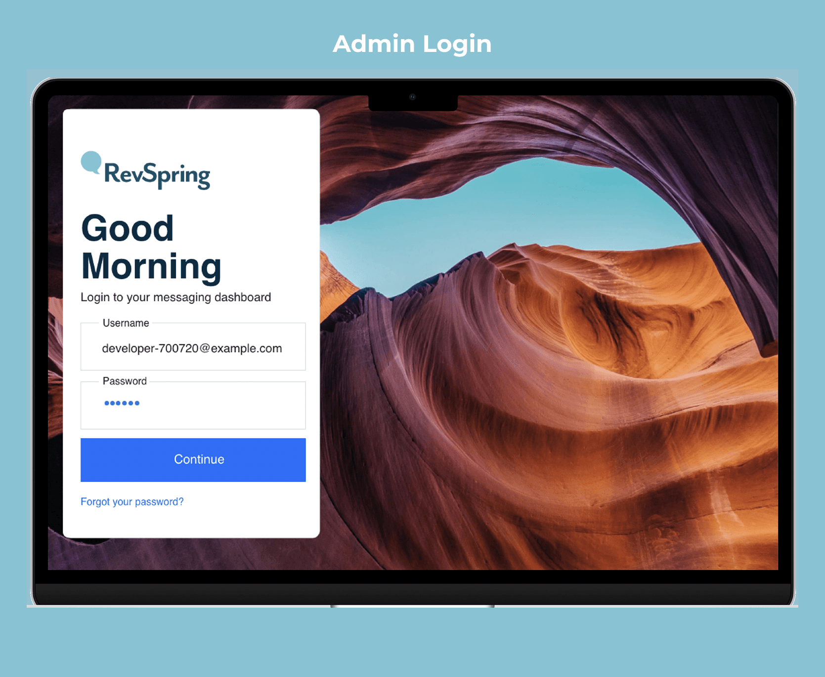
#1 Admin login screen
Redesigned the admin login experience to establish a trusted entry point for administrative teams.
Built immediate trust so staff can start their workflow confidently.
#2 Simplified search option
Streamlined the system search to simplify navigation for administrative staff.
Enabled staff to quickly check and validate patient information confidently.
#3 Scheduling Flow
Transformed appointment management with a frictionless architecture that bridges the gap between staff and patients.
This clear, intuitive feature allows administrators to easily coordinate availability, manage updates, and send automated reminders.
Final Design Highlights
#1 Admin login screen
Redesigned the admin login experience to establish a trusted entry point for administrative teams.
Built immediate trust so staff can start their workflow confidently.
#2 Simplified search option
Streamlined the system search to simplify navigation for administrative staff.
Enabled staff to quickly check and validate patient information confidently.
#3 Scheduling Flow
Transformed appointment management with a frictionless architecture that bridges the gap between staff and patients.
This clear, intuitive feature allows administrators to easily coordinate availability, manage updates, and send automated reminders.
Overview
RevSpring Enterprise is a healthcare provider platform that enables administrative teams to manage patient information and schedule or reschedule appointments, supporting a more efficient and coordinated care experience.
What I Did
I redesigned the platform’s core desktop dashboard and admin workflows to reduce friction, improve clarity, and support more efficient patient operations for administrative teams across North America.
My Impact
Transformed a fragmented rescheduling experience into a clear, confident, and role-aware workflow for administrative teams.
The Problem
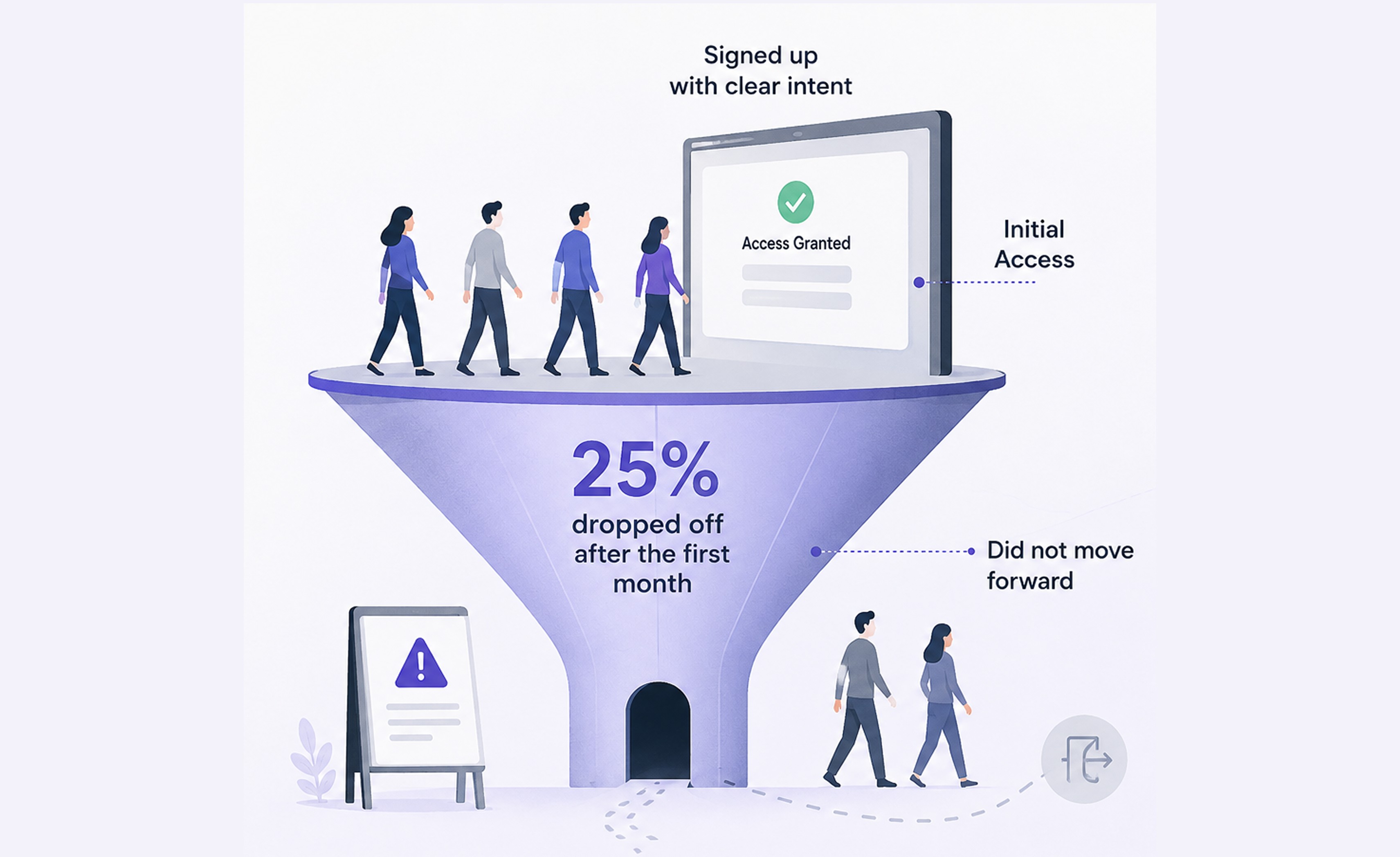
25% of new administrative staff dropped off after their first month
Internal data showed that while many administrative teams signed up with clear intent, a significant number did not move forward after gaining initial access. As RevSpring aimed to scale its enterprise healthcare platform, we needed to understand what was causing this early drop-off and where the experience was breaking down.
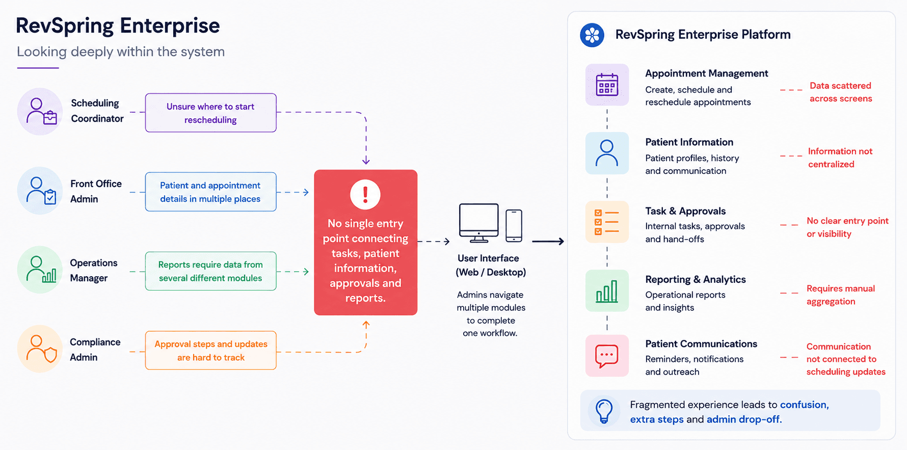
Looking deeply within the system
Tasks, approvals, reports, and patient information were fragmented across the platform.
To understand why new administrative teams dropped off, I mapped how different roles and existing members navigated the system. A clear pattern emerged: there was no single place for staff to start, leaving them to piece together the workflow on their own.
Research
Reducing workflow drop-offs through clearer action visibility
To understand what was driving early workflow drop-offs, I collaborated with the RevSpring Product Manager to conduct 2 user interviews and reviewed 5+ global enterprise healthcare platforms to identify patterns, usability gaps, and opportunities for improvement.
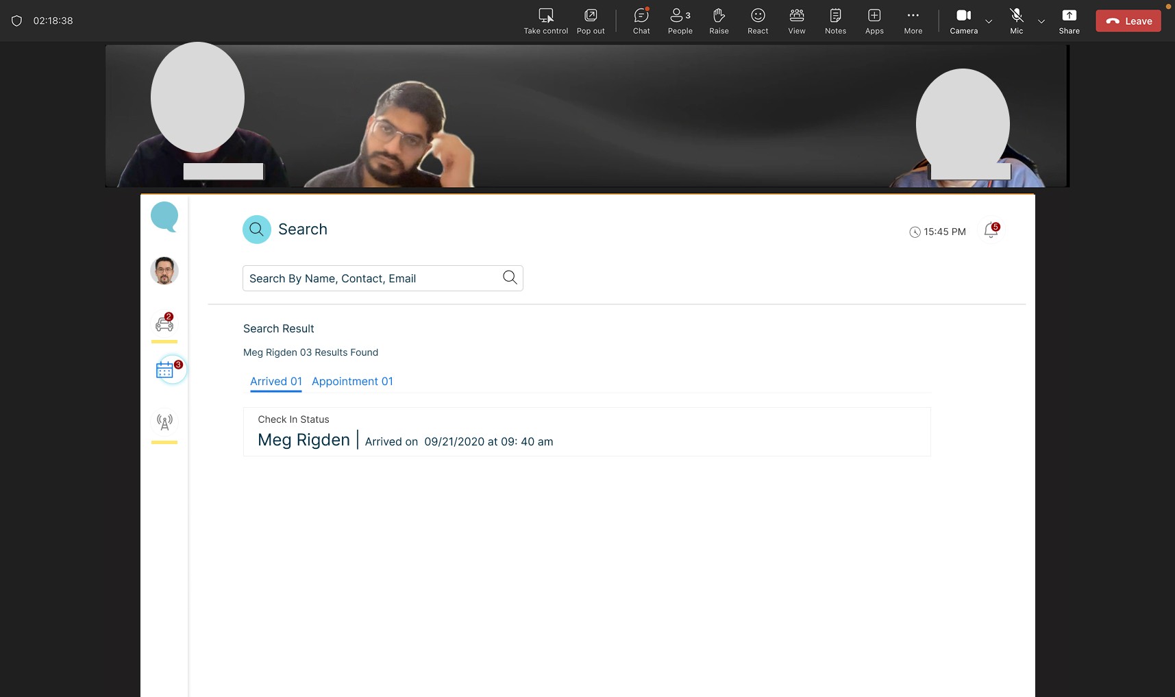
Key Research Insights
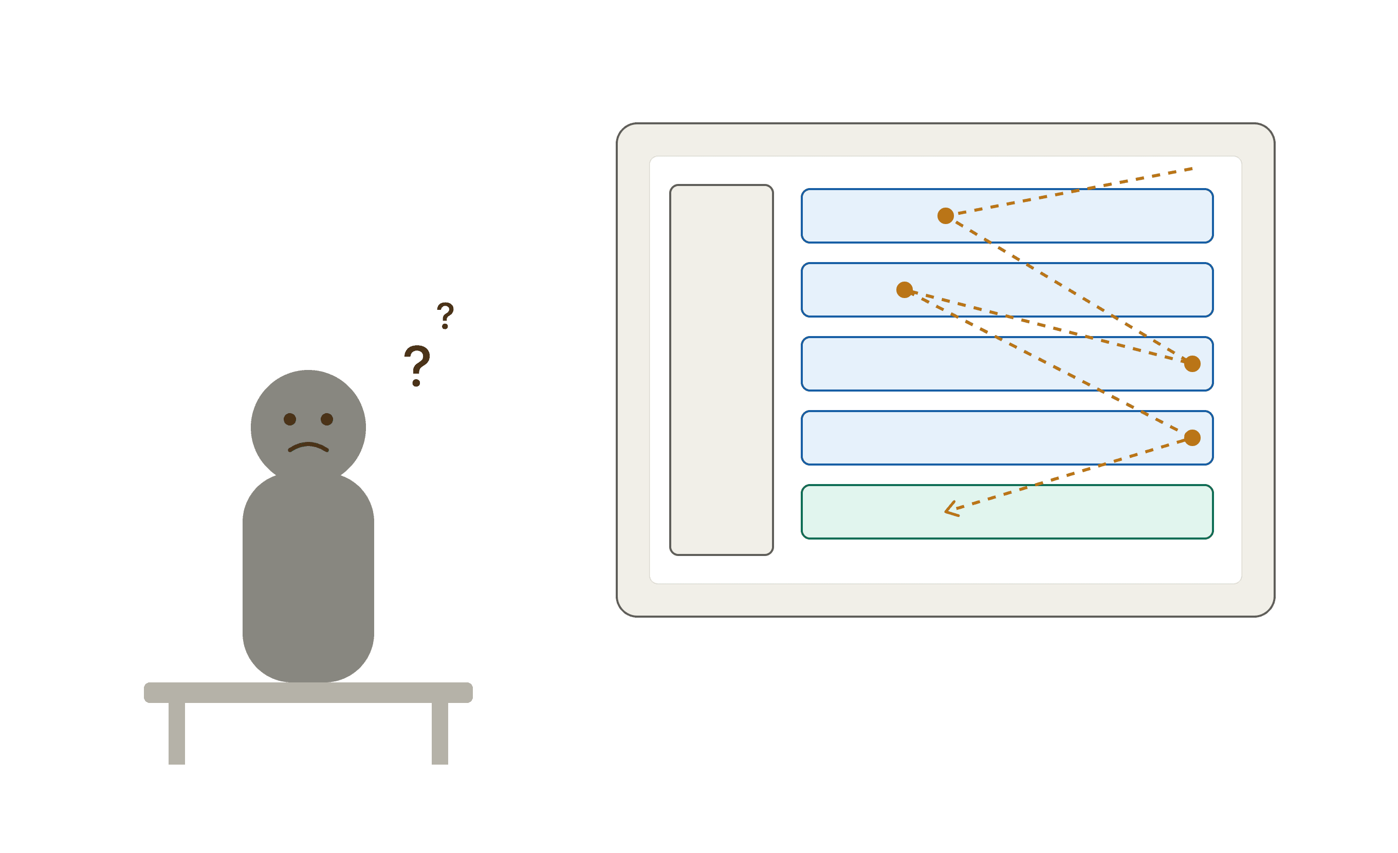

The Constraints & Boundaries
Within these constraints, I collaborated with engineers, RevSpring’s Product Manager, and business partners to define a focused MVP for the scheduling flow. We prioritised the entry experience and core workflow areas that had the greatest impact on early adoption. I took ownership of redesigning the web scheduling flow experience as the first point of intervention.
Design Goal
How might we help new admin teams confidently navigate the scheduling workflow by clarifying where to start, how to schedule appointments, and how to communicate appointment reminders?
Design Execution
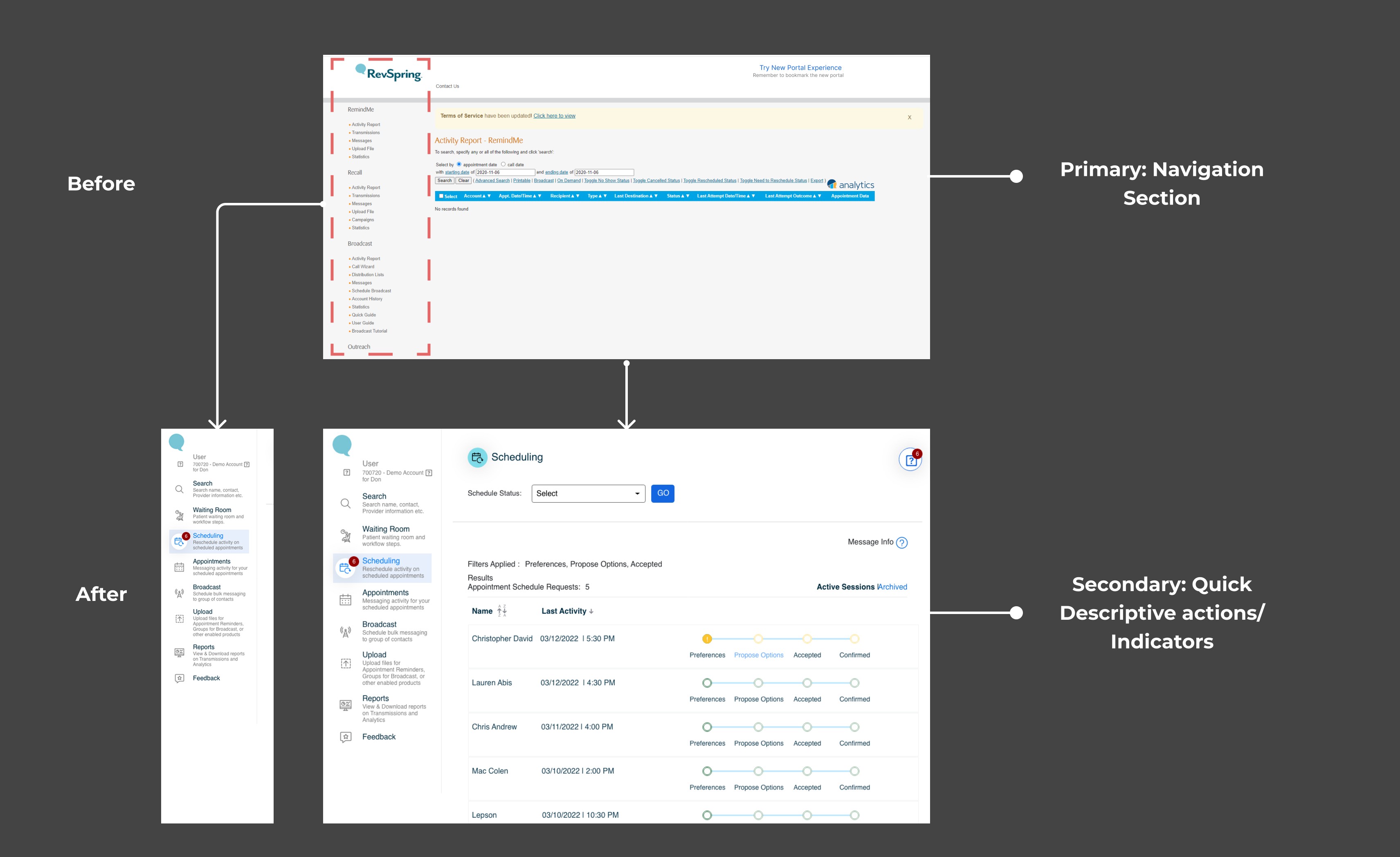
Start Phase:
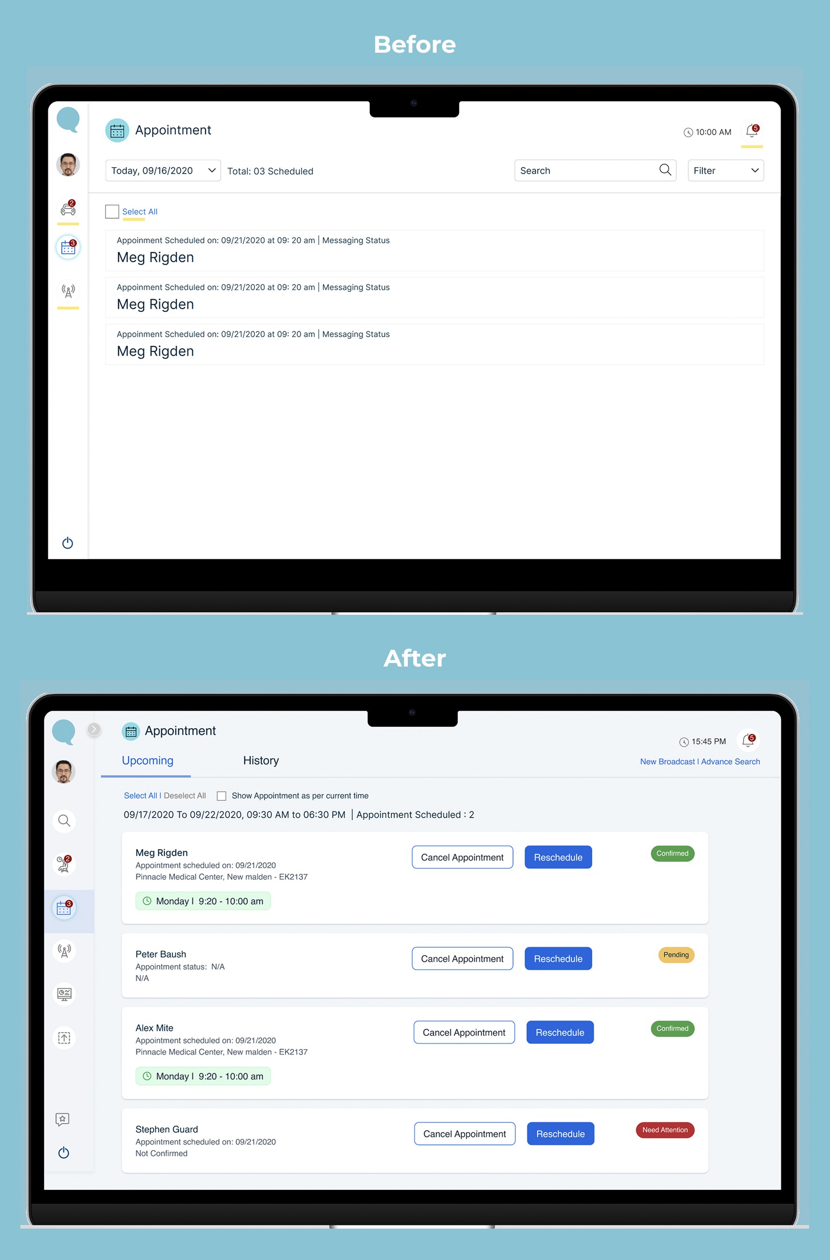
The original navigation suffered from high cognitive load, mixing unrelated administrative tasks with outdated UI patterns.
This left new admins confused about their immediate next steps.
To create a seamless entry point, I restructured the information architecture, stripping away secondary actions to surface a centralised dashboard focused purely on primary user goals: immediate login success and high-frequency actions.
Schedule Phase:
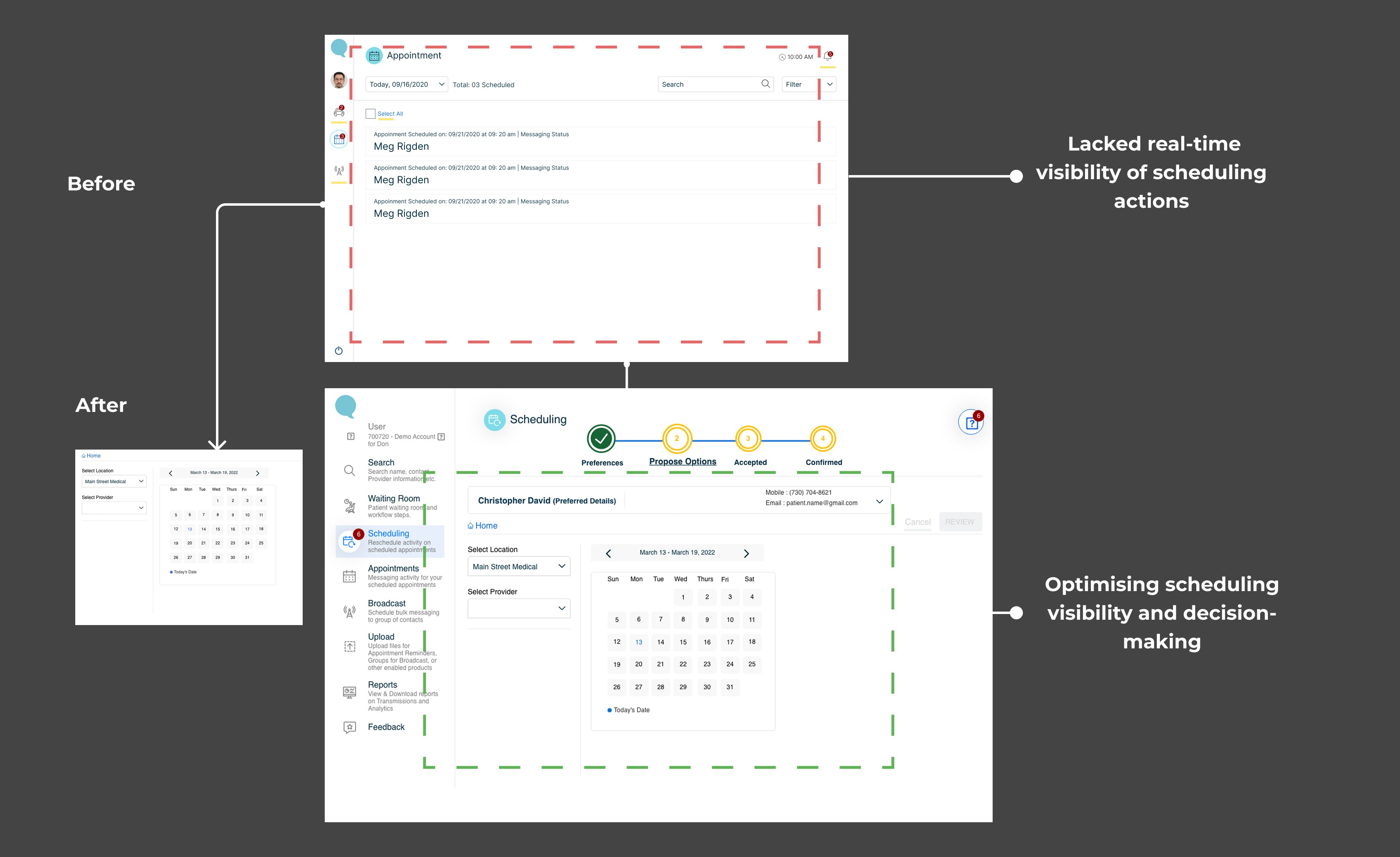
User interviews revealed that the original dashboard lacked real-time visibility into the scheduling pipeline, forcing admins to manually search for task statuses.
To solve this, I designed a high-density operational dashboard layout.
I introduced dynamic status indicators and a centralised calendar view that surfaced high-priority scheduling bottlenecks upfront, reducing the cognitive load required to make booking decisions.
Remind Phase:
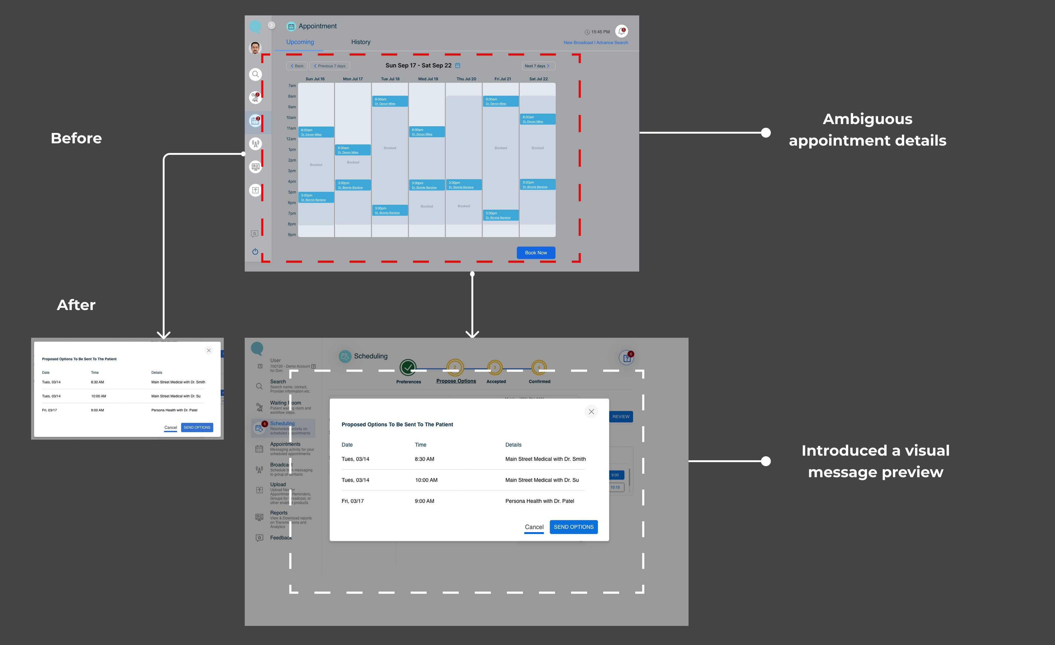
Ambiguous appointment details previously triggered an influx of patient clarification requests, overwhelming new admin teams.
I resolved this by restructuring the reminder confirmation workflow.
I introduced a visual message preview panel during the slot-selection phase, ensuring admins could verify critical details before hit sending. This strategic friction point dramatically reduced post-booking communication loops and minimised operational uncertainty.
Final Solution
A unified scheduling experience designed to reduce cognitive overload for enterprise healthcare admins, streamlining their daily workflow to make booking appointments faster and error-free.
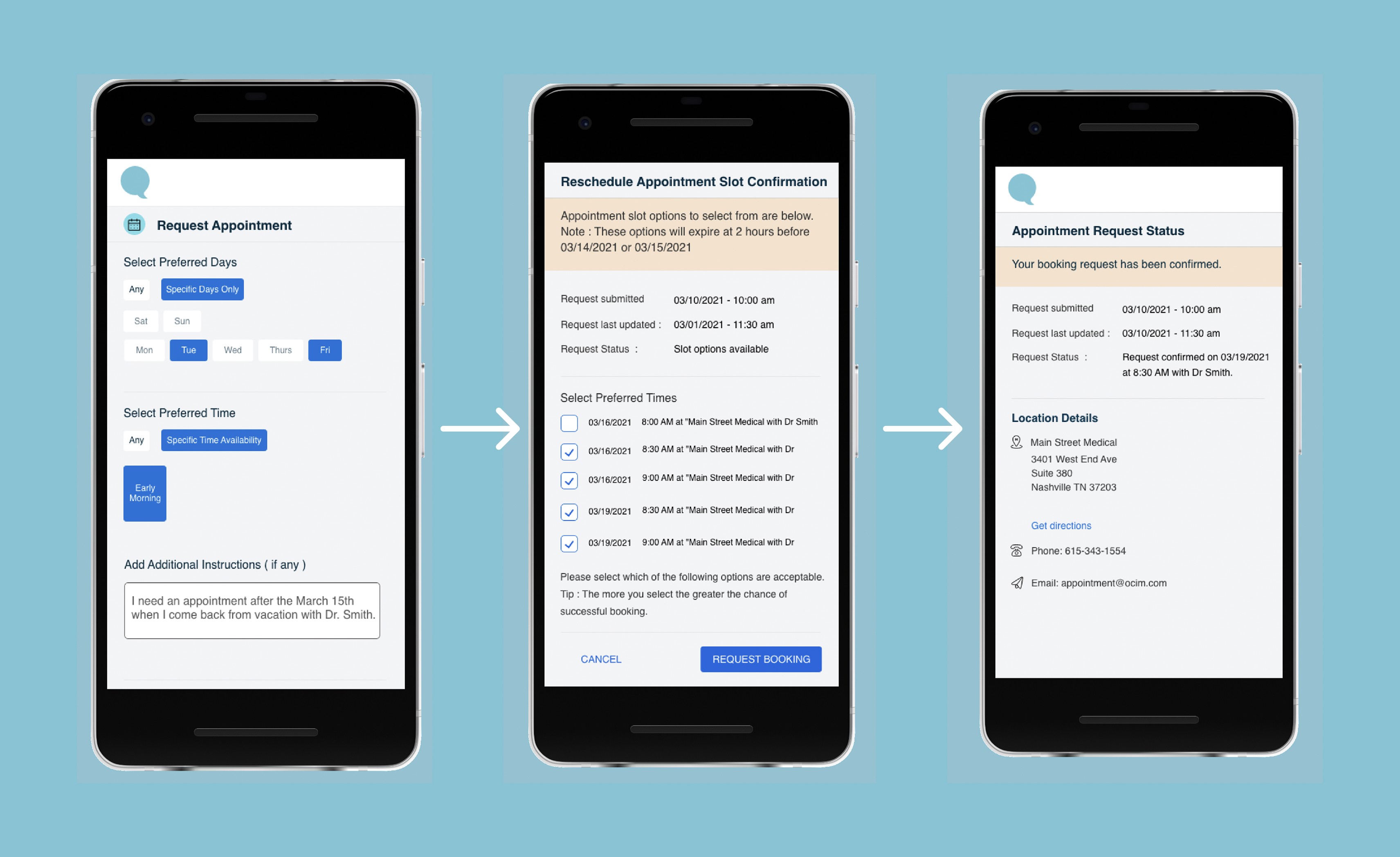
Additional Screens - App Redesign
Impact & Takeways
The redesigned dashboard brought immediate clarity and efficiency to the enterprise scheduling workflow.
📉 Lower Retention Friction: Significantly decreased early drop-off rates among new admin teams.
⏱️ Workflow Acceleration: Improved day-to-day task clarity and appointment booking speed.
💬 Stakeholder Alignment: Received positive feedback from internal operations teams.
Reflection
🏛️ Designing Within Strict Constraints
This was my first time designing for an enterprise healthcare product governed by strict regulatory boundaries.
I focused my efforts where they mattered most: optimising information structure, visual hierarchy, and decision clarity.
By maintaining open communication channels with PMs, engineers, and the RevSpring team, I discovered how a designer can actively drive alignment and accelerate decision-making in a cross-functional environment.
📊 Data > Insights
Instead of relying on assumptions, I grounded every design choice in evidence. This completely transformed our cross-team discussions.
Conversations shifted from “I think…” to “Here is what the data shows, and here is how this layout solves it.”
This approach taught me how to defend design decisions by aligning user experience directly with measurable business impact, not just aesthetics.
🔍 Future Considerations
Given more time, I would explore integrating proactive, AI-driven workflow guidance.
As enterprise healthcare workflows grow in complexity, a predictive system could instantly highlight high-priority tasks for admin staff-helping them understand exactly what requires immediate attention while strictly adhering to existing regulatory constraints.
The Problem
25% of new administrative staff dropped off after their first month
Internal data showed that while many administrative teams signed up with clear intent, a significant number did not move forward after gaining initial access. As RevSpring aimed to scale its enterprise healthcare platform, we needed to understand what was causing this early drop-off and where the experience was breaking down.
Looking deeply within the system
Tasks, approvals, reports, and patient information were fragmented across the platform.
To understand why new administrative teams dropped off, I mapped how different roles and existing members navigated the system. A clear pattern emerged: there was no single place for staff to start, leaving them to piece together the workflow on their own.
Research
Reducing workflow drop-offs through clearer action visibility
To understand what was driving early workflow drop-offs, I collaborated with the RevSpring Product Manager to conduct 2 user interviews and reviewed 5+ global enterprise healthcare platforms to identify patterns, usability gaps, and opportunities for improvement.
Key Research Insights
The Constraints & Boundaries
Within these constraints, I collaborated with engineers, RevSpring’s Product Manager, and business partners to define a focused MVP for the scheduling flow. We prioritised the entry experience and core workflow areas that had the greatest impact on early adoption. I took ownership of redesigning the web scheduling flow experience as the first point of intervention.
Design Goal
How might we help new admin teams confidently navigate the scheduling workflow by clarifying where to start, how to schedule appointments, and how to communicate appointment reminders?
Design Execution
Start Phase:
The original navigation suffered from high cognitive load, mixing unrelated administrative tasks with outdated UI patterns.
This left new admins confused about their immediate next steps.
To create a seamless entry point, I restructured the information architecture, stripping away secondary actions to surface a centralised dashboard focused purely on primary user goals: immediate login success and high-frequency actions.
Schedule Phase:
User interviews revealed that the original dashboard lacked real-time visibility into the scheduling pipeline, forcing admins to manually search for task statuses.
To solve this, I designed a high-density operational dashboard layout.
I introduced dynamic status indicators and a centralised calendar view that surfaced high-priority scheduling bottlenecks upfront, reducing the cognitive load required to make booking decisions.
Remind Phase:
Ambiguous appointment details previously triggered an influx of patient clarification requests, overwhelming new admin teams.
I resolved this by restructuring the reminder confirmation workflow.
I introduced a visual message preview panel during the slot-selection phase, ensuring admins could verify critical details before hit sending. This strategic friction point dramatically reduced post-booking communication loops and minimised operational uncertainty.
Final Solution
A unified scheduling experience designed to reduce cognitive overload for enterprise healthcare admins, streamlining their daily workflow to make booking appointments faster and error-free.
Additional Screens - App Redesign
Impact & Takeways
The redesigned dashboard brought immediate clarity and efficiency to the enterprise scheduling workflow.
📉 Lower Retention Friction: Significantly decreased early drop-off rates among new admin teams.
⏱️ Workflow Acceleration: Improved day-to-day task clarity and appointment booking speed.
💬 Stakeholder Alignment: Received positive feedback from internal operations teams.
Reflection
🏛️ Designing Within Strict Constraints
This was my first time designing for an enterprise healthcare product governed by strict regulatory boundaries.
I focused my efforts where they mattered most: optimising information structure, visual hierarchy, and decision clarity.
By maintaining open communication channels with PMs, engineers, and the RevSpring team, I discovered how a designer can actively drive alignment and accelerate decision-making in a cross-functional environment.
📊 Data > Insights
Instead of relying on assumptions, I grounded every design choice in evidence. This completely transformed our cross-team discussions.
Conversations shifted from “I think…” to “Here is what the data shows, and here is how this layout solves it.”
This approach taught me how to defend design decisions by aligning user experience directly with measurable business impact, not just aesthetics.
🔍 Future Considerations
Given more time, I would explore integrating proactive, AI-driven workflow guidance.
As enterprise healthcare workflows grow in complexity, a predictive system could instantly highlight high-priority tasks for admin staff-helping them understand exactly what requires immediate attention while strictly adhering to existing regulatory constraints.
Other projects


Open to opportunities
Let’s talk UX, collaborations, or anything design!
Open to opportunities
Let’s talk UX, collaborations, or anything design!
Open to opportunities
Let’s talk UX, collaborations, or anything design!
Presented by Vivek Mithawala
Presented by Vivek Mithawala
Presented by Vivek Mithawala