
Habitual - From failed searches to confident purchases
Increased user trust by 33% through intuitive shopping experience
Project Type
E-commerce Mobile Contract Project
Team
2 Product Designers (including me), 1 Software Engineer, 1 Finance Analyst
Duration
1 year 6 months (Jan 2025-June 2026)
Final Design Highlights
Making a product payment
Supported informed buying decisions while eliminating checkout friction
Enabled direct product customisation on the homepage to accelerate the shopping journey
Searching a product
Structured the search results layout to feel more systematic and easier to scan
Navigation and quick-search features help users find products faster
Final Design Highlights
Making a product payment
Supported informed buying decisions while eliminating checkout friction
Enabled direct product customisation on the homepage to accelerate the shopping journey
Searching a product
Structured the search results layout to feel more systematic and easier to scan
Navigation and quick-search features help users find products faster
Overview
Habitual is a gift and novelty retailer located in Leicester, UK, focused on enhancing consumer outcomes through user-friendly digital tools.
I conducted targeted user research that uncovered critical pain points, leading to a 8% reduction in failed product searches.
I transformed a confusing product discovery experience into a clear, intuitive journey.
This project resulted in a 33% improvement in the overall shopping experience, demonstrating my ability to translate user insights into intuitive, user-centred design solutions.
What I Did
Led end-to-end user research and synthesis
Conducted usability testing with 6 participants to identify challenges faced by users
Designed the search product experience and key checkout flow
Tasked with ideating micro-interactions on the product details page
Served as the primary contact between the team and Habitual stakeholders
As a design lead, I also conveyed design specifics and challenges to the engineer
My Impact
Testing showed improvements in user trust and finding specific products within one minute of searching.
The Context
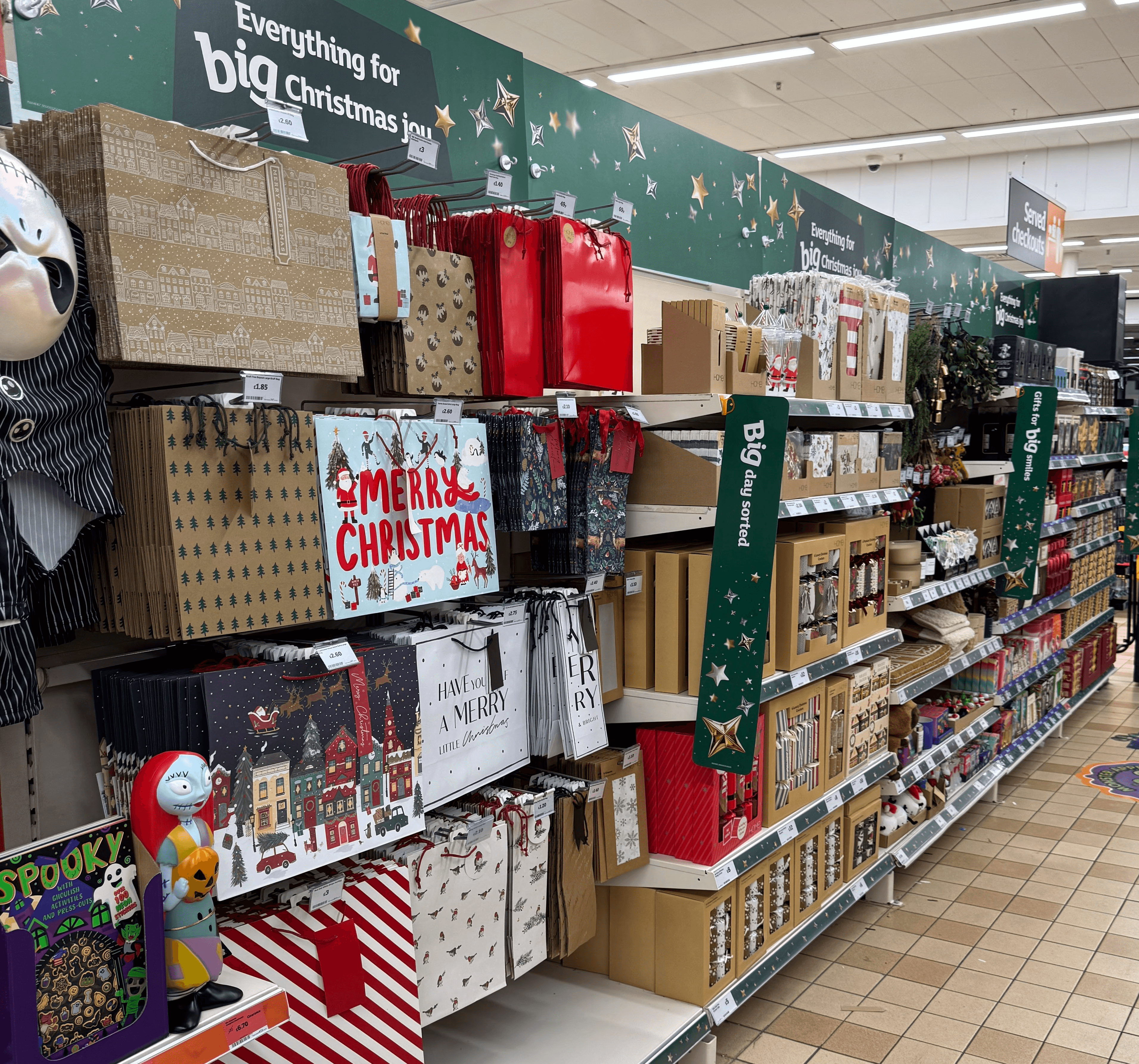
As Thanksgiving and Christmas approach each year, Habitual, a gift and novelty company, prepares for an increase in demand and looks for ways to improve its online shopping experience.
By creating a dedicated mobile experience, Habitual has an opportunity to better support its 4K+ mobile shoppers and encourage repeat purchases.
The Problem
Festive events can lead to longer wait times and product unavailability.
To make the shopping experience smoother, e-shoppers need to quickly find the products they want, easily navigate their wishlists and product information, and complete checkout without unnecessary friction
Why does it matter?
Shoppers — Uncertainty leads to slower decisions and longer waits.
Enterprise professionals — Time spent checking inventory takes focus away from marketing campaigns.
Business — Lower purchases reduce checkout and marketplace efficiency.
Research
Picking Up the Pieces
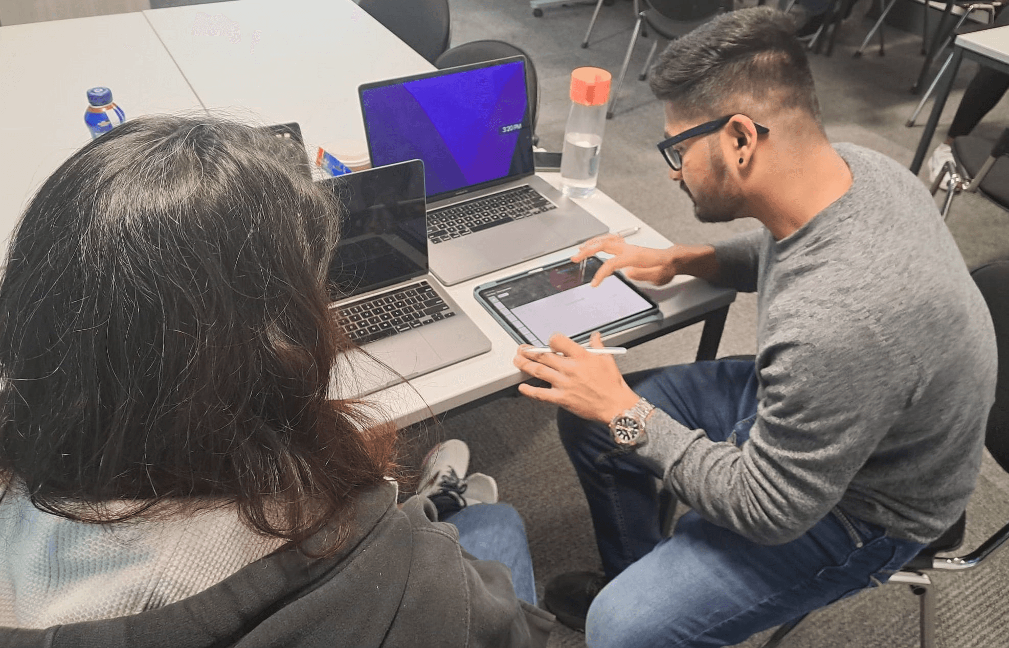
At the start of the project, I wanted to understand the clear mission and defined goals for Habitual's mobile shopping experience. Using some pre-existing insights as a starting point, I conducted usability testing with six participants to understand how habitual consumers searched for and found products.
My goal was to uncover the challenges they faced, understand the workarounds they used, and identify opportunities to improve their overall shopping experience.
Key Research Insights
The moments of high uncertainty became our focus for design improvement.
Throughout the shopping experience, consumers developed their own workarounds whenever they felt stuck while completing an action in the app.
Observing these behaviours helped reveal where users lacked guidance and felt uncertain.
These moments were particularly important because they often made it harder for consumers to find the right product or continue through the shopping journey.

01.
Looks through deals hoping to find the right product.

02.
Tries different keywords when the search doesn't return the expected product.

03.
Feels uncertain while reviewing the product information.

04.
Leaves the process when the cart option isn't clearly visible.
We Redefined The Challenge - Opportunity Space
How might we reduce uncertainty throughout the shopping journey and help consumers make confident decisions?
Ideation Process
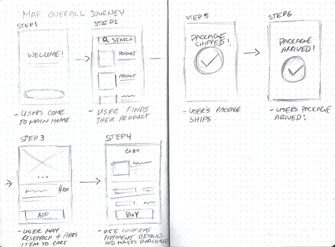
Sketching became an integral part of the initial ideation phase, helping us explore how the product experience could respond to the insights we had uncovered.
I am not able to see the cart and its not allowing me to go further - P3
Why I am not getting the product I want is there something I'm missing out - P5
These findings shaped two design principles that guided our design decisions while staying aligned with the company's guidelines:
Balance transparency within the app
Preserve product clarity to support cart decisions
We explored this opportunity through sketches and low-fidelity frames, focusing on how product information could be made simpler, clearer, and more accessible while identifying the features that would best support the shopping journey.

Design Direction
Based on the research insights and ideation process, I explored two approaches to help consumers find the right products while balancing transparency with user control.
Registering their interests

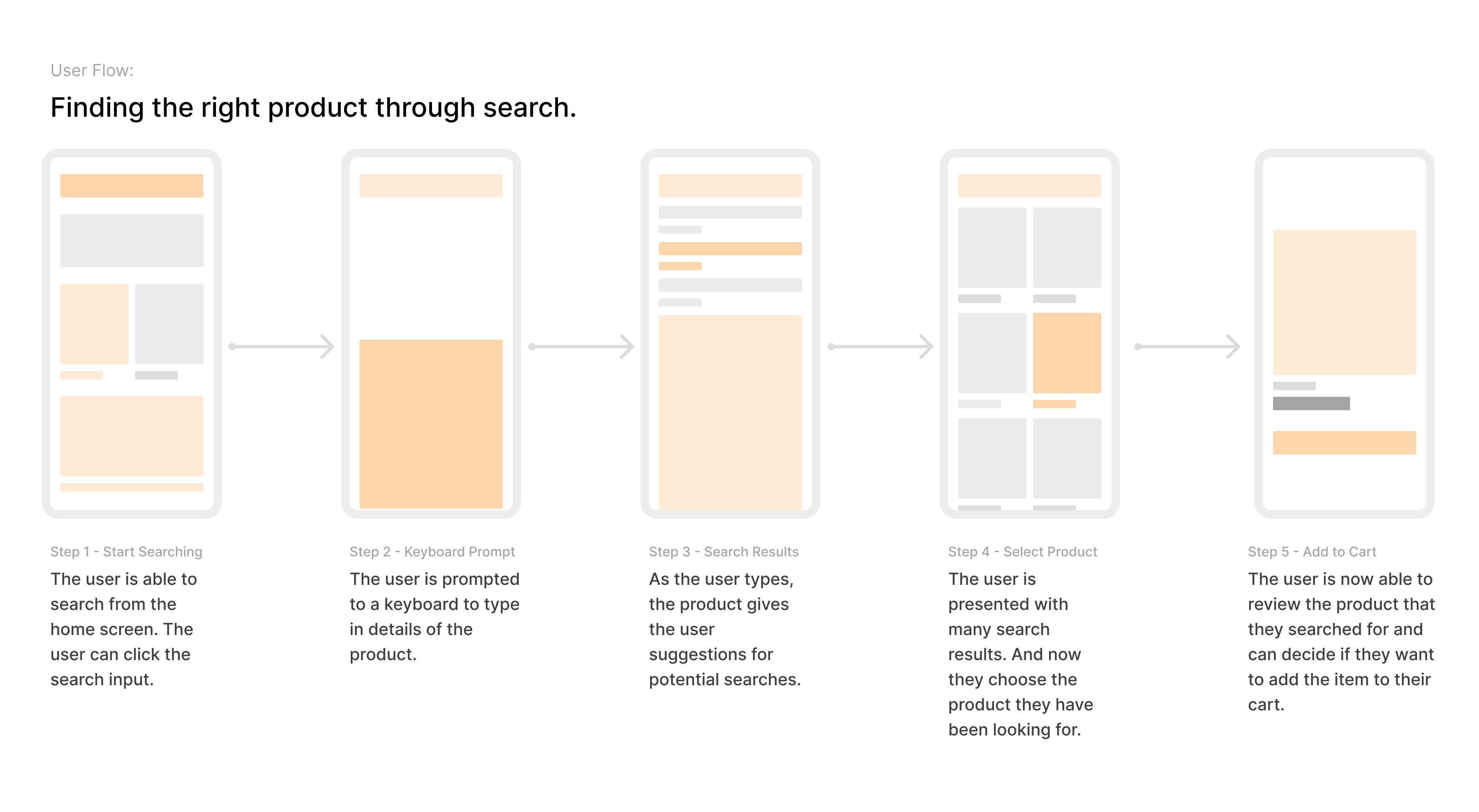
Finding the right product through search
Assessing The Structure
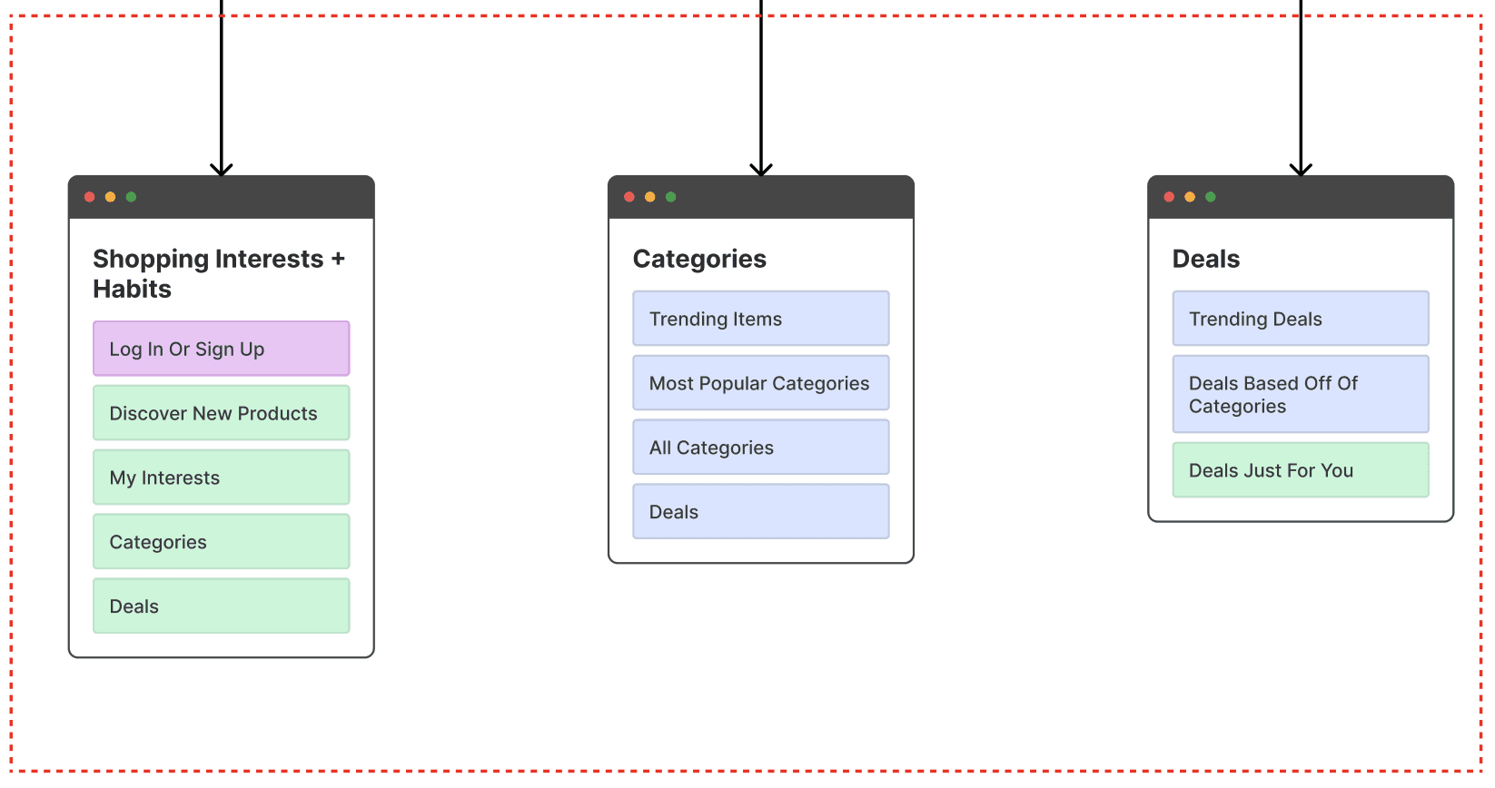
After creating the user stories, I explored mind-mapping certain scenarios to make product search simpler and more intuitive, so customers could find what they were looking for with less effort and clear guidance
Final Design
Supporting product selection through informed decisions and effortless cart management
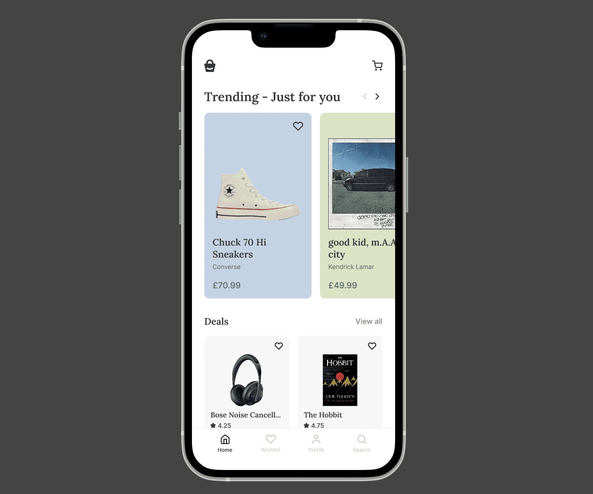
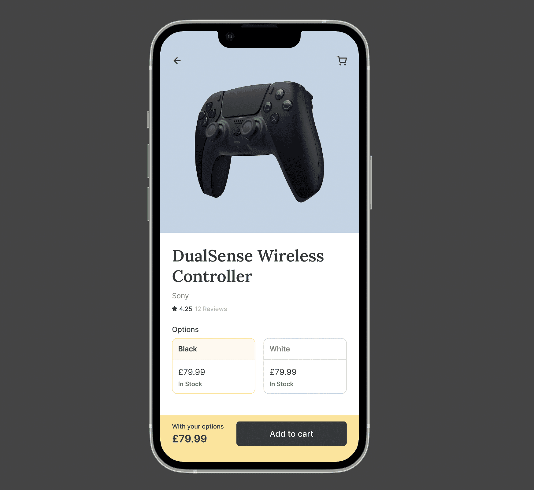
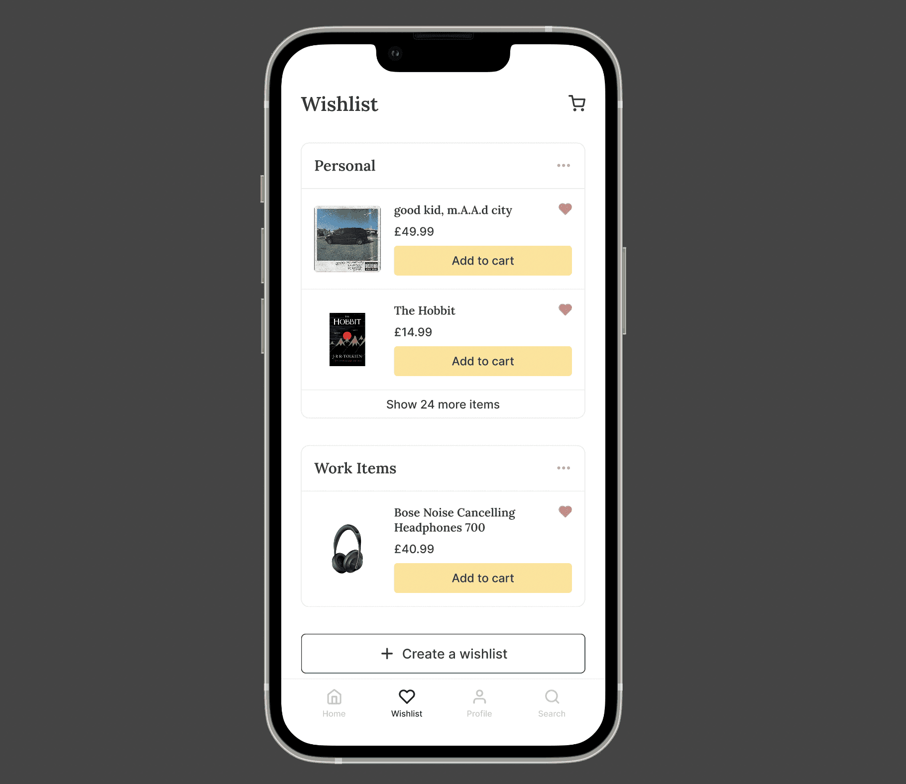
The final experience brings together guided recommendations through Just for You, Deals, and My Interests, helping consumers discover relevant products with greater clarity.
It also makes product customisation easier and provides a clear checkout flow, supporting consumers in making more confident purchasing decisions.
Impact
Testing showed improvements in consumers' perceived trust and sense of control when navigating information-heavy parts of the shopping experience.
Stakeholder Response
Habitual stakeholders responded positively to the conceptual sketches, research findings, and design rationale presented ahead of the first launch review.
Validated Outcomes
I conducted post-test usability testing with 8 participants. Compared with the original prototype, participants reported higher ratings for:
Reflection
Beyond analysing research findings, this project helped me grow as a designer and strengthened the way I approach product design and leadership.
Progressive Iteration
This project showed me how much potential there is in continuously refining a product based on what people actually need.
As I iterated on the screens, I learned that it isn't about showing everything at once, but about organising the right information at the right time to reduce cognitive load and create a more personal experience.
Designing from Behaviour
Usability testing provided behavioural insights that helped inform our design decisions. Watching participants interact with the app and complete tasks revealed behaviours that may not have surfaced through interviews alone.
These observations helped us create clearer interactions and make the shopping experience easier to navigate, supporting faster and more confident purchasing decisions.
Final Design Prototype
The Context
As Thanksgiving and Christmas approach each year, Habitual, a gift and novelty company, prepares for an increase in demand and looks for ways to improve its online shopping experience.
By creating a dedicated mobile experience, Habitual has an opportunity to better support its 4K+ mobile shoppers and encourage repeat purchases.
The Problem
Festive events can lead to longer wait times and product unavailability.
To make the shopping experience smoother, e-shoppers need to quickly find the products they want, easily navigate their wishlists and product information, and complete checkout without unnecessary friction
Why does it matter?
Shoppers — Uncertainty leads to slower decisions and longer waits.
Enterprise professionals — Time spent checking inventory takes focus away from marketing campaigns.
Business — Lower purchases reduce checkout and marketplace efficiency.
Research
Picking Up the Pieces
At the start of the project, I wanted to understand the clear mission and defined goals for Habitual's mobile shopping experience. Using some pre-existing insights as a starting point, I conducted usability testing with six participants to understand how habitual consumers searched for and found products.
My goal was to uncover the challenges they faced, understand the workarounds they used, and identify opportunities to improve their overall shopping experience.
Key Research Insights
The moments of high uncertainty became our focus for design improvement.
Throughout the shopping experience, consumers developed their own workarounds whenever they felt stuck while completing an action in the app.
Observing these behaviours helped reveal where users lacked guidance and felt uncertain.
These moments were particularly important because they often made it harder for consumers to find the right product or continue through the shopping journey.
01.
Looks through deals hoping to find the right product.
02.
Tries different keywords when the search doesn't return the expected product.
03.
Feels uncertain while reviewing the product information.
04.
Leaves the process when the cart option isn't clearly visible.
We Redefined The Challenge - Opportunity Space
How might we reduce uncertainty throughout the shopping journey and help consumers make confident decisions?
Ideation Process
Sketching became an integral part of the initial ideation phase, helping us explore how the product experience could respond to the insights we had uncovered.
I am not able to see the cart and its not allowing me to go further - P3
Why I am not getting the product I want is there something I'm missing out - P5
These findings shaped two design principles that guided our design decisions while staying aligned with the company's guidelines:
Balance transparency within the app
Preserve product clarity to support cart decisions
We explored this opportunity through sketches and low-fidelity frames, focusing on how product information could be made simpler, clearer, and more accessible while identifying the features that would best support the shopping journey.
Design Direction
Based on the research insights and ideation process, I explored two approaches to help consumers find the right products while balancing transparency with user control.
Registering their interests
Finding the right product through search
Assessing The Structure
After creating the user stories, I explored mind-mapping certain scenarios to make product search simpler and more intuitive, so customers could find what they were looking for with less effort and clear guidance
Final Design
Supporting product selection through informed decisions and effortless cart management
The final experience brings together guided recommendations through Just for You, Deals, and My Interests, helping consumers discover relevant products with greater clarity.
It also makes product customisation easier and provides a clear checkout flow, supporting consumers in making more confident purchasing decisions.
Impact
Testing showed improvements in consumers' perceived trust and sense of control when navigating information-heavy parts of the shopping experience.
Stakeholder Response
Habitual stakeholders responded positively to the conceptual sketches, research findings, and design rationale presented ahead of the first launch review.
Validated Outcomes
I conducted post-test usability testing with 8 participants. Compared with the original prototype, participants reported higher ratings for:
Reflection
Beyond analysing research findings, this project helped me grow as a designer and strengthened the way I approach product design and leadership.
Progressive Iteration
This project showed me how much potential there is in continuously refining a product based on what people actually need.
As I iterated on the screens, I learned that it isn't about showing everything at once, but about organising the right information at the right time to reduce cognitive load and create a more personal experience.
Designing from Behaviour
Usability testing provided behavioural insights that helped inform our design decisions. Watching participants interact with the app and complete tasks revealed behaviours that may not have surfaced through interviews alone.
These observations helped us create clearer interactions and make the shopping experience easier to navigate, supporting faster and more confident purchasing decisions.
Final Design Prototype
Other projects


Open to opportunities
Let’s talk UX, collaborations, or anything design!
Open to opportunities
Let’s talk UX, collaborations, or anything design!
Open to opportunities
Let’s talk UX, collaborations, or anything design!
Presented by Vivek Mithawala
Presented by Vivek Mithawala
Presented by Vivek Mithawala