
GoGreen - Enhancing homegrown food for organic living
From usability breakdowns to a 35% lift in consumer awareness around organic living
Project Type
Consumer IoT Contract Project
Team
1 UX Researcher/Designer (Me), 2 Product Designers, 1 Software Engineer, 1 Finance Analyst and 1 Content Writer
Duration
7 months (Feb 2024-Aug 2024)
Final Design Highlights
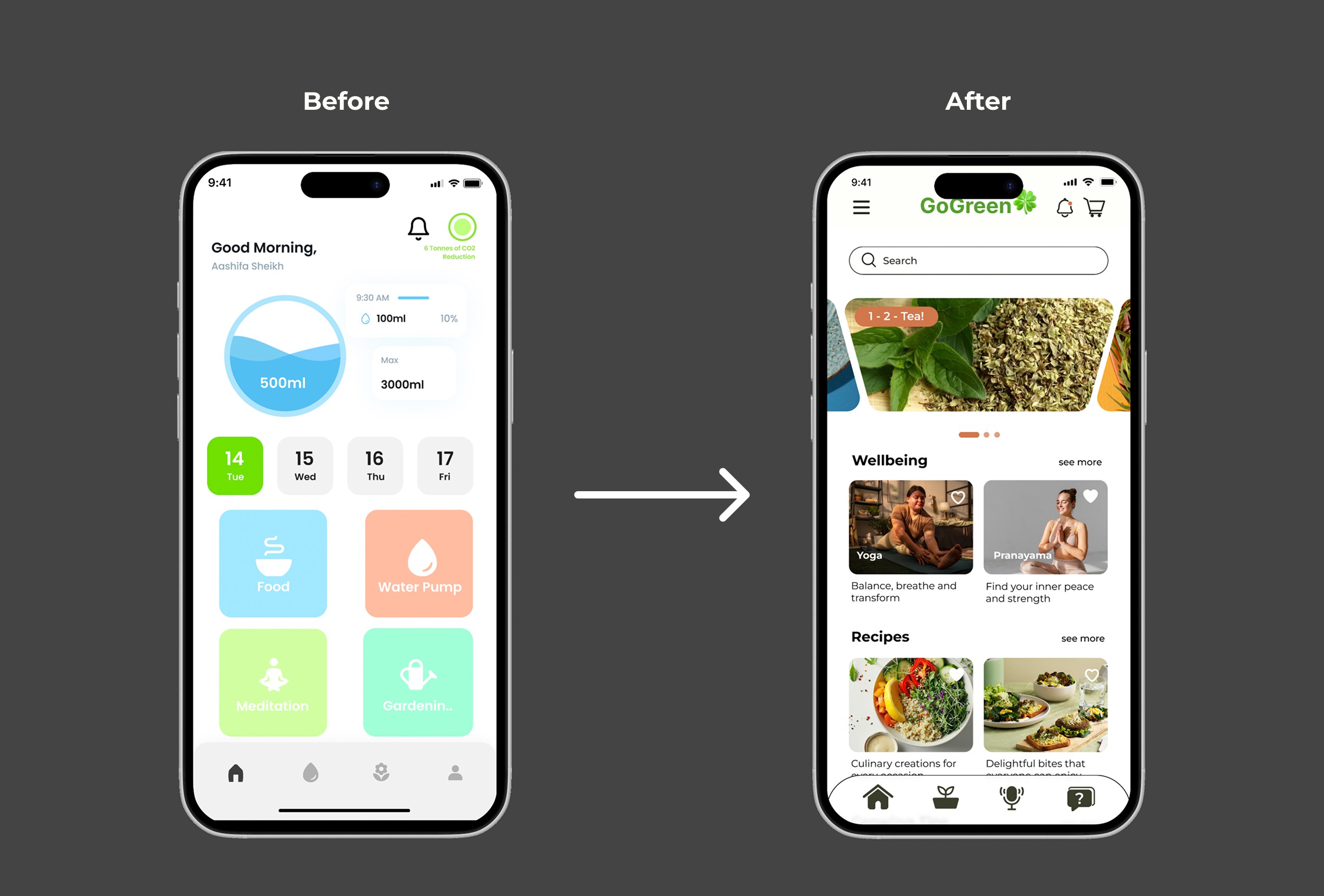
Navigating Dashboard
Boosted the intuitive dashboard navigation experience, reducing user friction.
Mindful visual hierarchy
Optimising visual hierarchy clarifies layouts to highlight key actions.
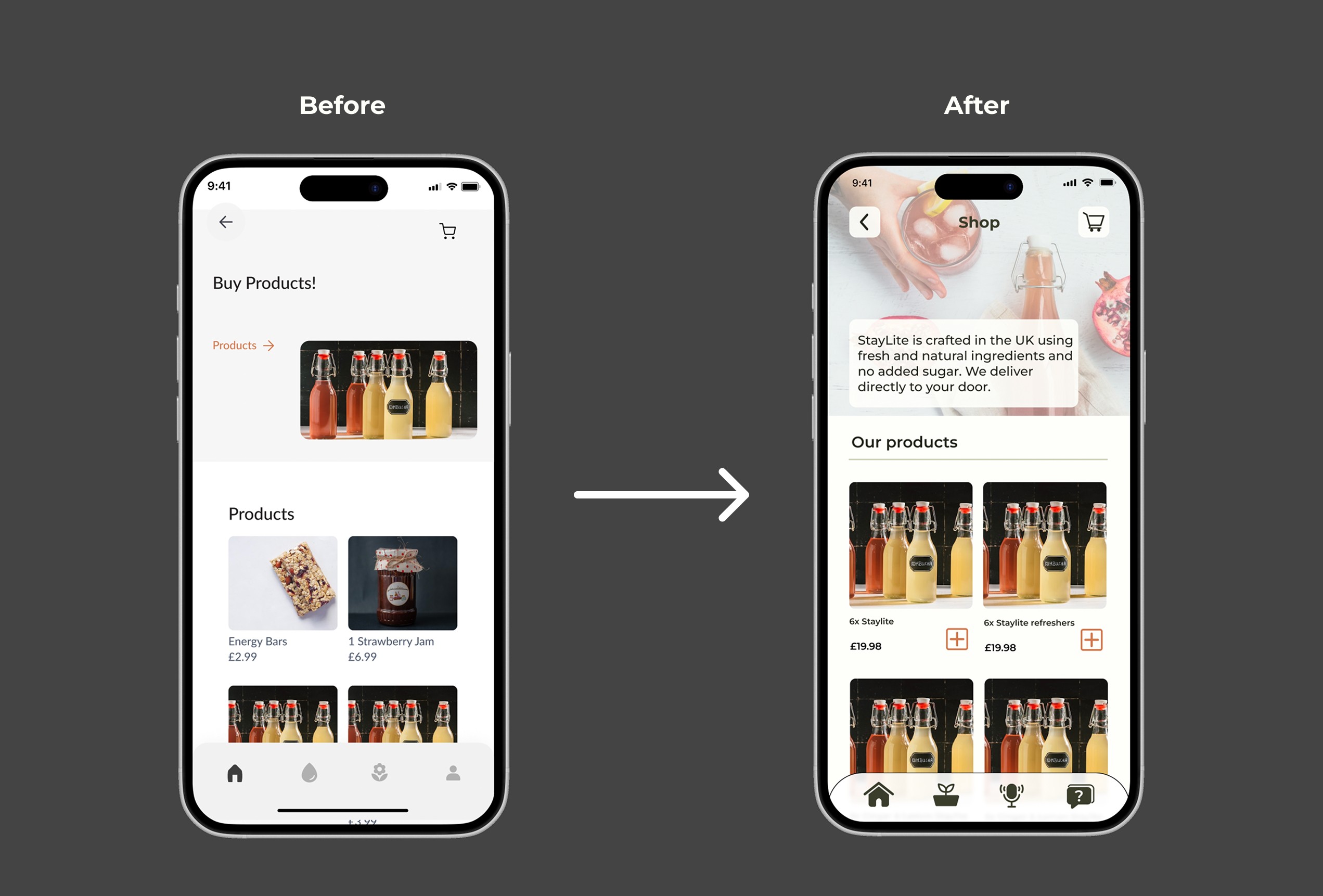
Redesigned Shop Experience
Providing a clear selection of products to streamline the browsing experience and accelerate checkout completion rates.
Final Design Highlights
Navigating Dashboard
Boosted the intuitive dashboard navigation experience, reducing user friction.
Mindful visual hierarchy
Optimising visual hierarchy clarifies layouts to highlight key actions.
Redesigned Shop Experience
Providing a clear selection of products to streamline the browsing experience and accelerate checkout completion rates.
Overview
GoGreen, a Health & Wellness company based in the UK, created a self-sufficient indoor growing system paired with a mobile app that puts the whole experience in the user's hands.
The goal isn't just to grow herbs and vegetables indoors; it's to give people year-round access to fresh, organic food without a garden, a balcony, or even much spare time, while folding in a bit of mindfulness along the way.
What I Did
Led end-to-end user research and product design
Conducted moderated interviews with the product owner and 11 consumer participants
Reframed the app's positioning from a broad wellness movement to a daily habit-forming experience
Partnered with the CEO, product owner, and engineering team to design the app's information architecture.
As UX Design Head, bridged the gap between design ideation and technical execution, aligning the product vision with engineering
My Impact
From answering "How do I care for my plants indoors?" to delivering healthy recipes that support organic living.
The Context
As our environment continues to change, so does the way we think about our health, food, and everyday lifestyle. GoGreen identified an opportunity to address a challenge that goes beyond simply growing and caring for plants indoors.
The bigger challenge is making healthy eating and sustainable living genuinely accessible not just for people with gardens, space, or time to maintain them, but also for those living in small flats in the middle of busy cities.

The Problem
Nearly one-third of people in the UK (29%) say they would prefer to eat fresh, organic food but do not have full access to it.
Business Challenge
Around 30% of returning clients were unaware of the shop feature that actually helped to monetise the business.



Research
I combined primary and secondary research to ground the redesign in real behaviour. Starting from GoGreen's existing customer personas as a baseline, I conducted moderated one-on-one interviews with the product owner and 11 consumer participants to validate those assumptions against real usage. This process surfaced 2 major usability breakdowns that directly shaped the design goals and decisions


Key Research Insights
Beyond surface-level design challenges, consumers revealed that the platform needed to serve a highly diverse user base rather than a single 'typical' persona.
The clearest insight was a distinct split in user intent: some utilized the app strictly for lifestyle and food recipes, while others engaged exclusively with the content and shopping features."

How I Changed The Strategy - Design Goal
From a feature-heavy dashboard to a focused first-launch experience
Initially, the team planned to place all key information and functionality on the main dashboard, as it appeared to be the most direct solution.
After I presented the research findings to the Product Owner and CEO, we aligned on a different direction: focus the first launch on improving the core dashboard experience rather than trying to surface everything at once.
The CEO also recognised that this focused approach aligned naturally with the company's long-term vision, giving us a clearer foundation to build on over time.
Design Decision
Decision 1: How do consumers understand to navigate easily
Before redesigning the dashboard for GoGreen's app, I first defined what the user exploration should look like:
Implementing a vertically stacked visual hierarchy to drive user discovery
Engineer suggested organising user intended content inside the navigation menu because that's how the backend stores the data
However, user interviews showed that consumers tend to take action if they see something useful

Decision 2: Designing an intent-driven checkout flow to boost order value
To streamline the shopping experience, I redesigned the Product Detail Page (PDP) to prioritise immediate action and absolute clarity.
By surfacing a persistent, high-contrast 'Add to Cart' button and restructuring the page layout to highlight essential product details first, I eliminated unnecessary cognitive load.

Final Design
Designed to promote healthy living, the final GoGreen platform streamlines both product purchasing and lifestyle management
By pairing clear visual hierarchy with deliberate feature prominence, the app's interface drives awareness around environmental well-being and mindfulness, while making healthy food delivery an effortless daily choice.
Impact
Minimised product specification ambiguity for Energisers and StayLite Kombuchas, creating a clearer product experience and a foundation for a scalable business model.
Business Outcomes
Shifted from feature-heavy layouts to a more balanced and visually clear experience.
Reduced customer service queries by improving the clarity and comprehension of product descriptions for fermented food products.
Established the core dashboard experience, including Wellbeing, Recipes, and Growing Tips, with persistent calls to action (CTAs) to make purchasing more seamless and support sales.
Measurement & Validation
Evaluated the redesign through a comparative usability study with 9 returning clients, testing identical tasks across the existing workflow and the redesigned prototype
Reflection
Iteration is key to designing better
While redesigning the product and introducing new behaviours, each iteration showed me how much small details and the right research inputs can influence the direction of a product. It reinforced the importance of using research to guide design decisions while staying aligned with core design principles. This process helped me think more structurally, refine the experience, and create an initial version ready for launch.
Building a system to manage workflows
This project gave me the opportunity to contribute across the product development process, from initial research through to final execution, while managing the team and collaborating with engineers. Working closely with the team allowed me to experiment with new ideas through ideation sessions and quickly filter them by validating them against research, business goals, technical constraints, and the product roadmap. This helped me become more structured in balancing user needs with business and technical considerations when making design decisions.
Additional Screens


The Context
As our environment continues to change, so does the way we think about our health, food, and everyday lifestyle. GoGreen identified an opportunity to address a challenge that goes beyond simply growing and caring for plants indoors.
The bigger challenge is making healthy eating and sustainable living genuinely accessible not just for people with gardens, space, or time to maintain them, but also for those living in small flats in the middle of busy cities.
The Problem
Nearly one-third of people in the UK (29%) say they would prefer to eat fresh, organic food but do not have full access to it.
Business Challenge
Around 30% of returning clients were unaware of the shop feature that actually helped to monetise the business.
Research
I combined primary and secondary research to ground the redesign in real behaviour. Starting from GoGreen's existing customer personas as a baseline, I conducted moderated one-on-one interviews with the product owner and 11 consumer participants to validate those assumptions against real usage. This process surfaced 2 major usability breakdowns that directly shaped the design goals and decisions
Key Research Insights
Beyond surface-level design challenges, consumers revealed that the platform needed to serve a highly diverse user base rather than a single 'typical' persona.
The clearest insight was a distinct split in user intent: some utilized the app strictly for lifestyle and food recipes, while others engaged exclusively with the content and shopping features."
How I Changed The Strategy - Design Goal
From a feature-heavy dashboard to a focused first-launch experience
Initially, the team planned to place all key information and functionality on the main dashboard, as it appeared to be the most direct solution.
After I presented the research findings to the Product Owner and CEO, we aligned on a different direction: focus the first launch on improving the core dashboard experience rather than trying to surface everything at once.
The CEO also recognised that this focused approach aligned naturally with the company's long-term vision, giving us a clearer foundation to build on over time.
Design Decision
Decision 1: How do consumers understand to navigate easily
Before redesigning the dashboard for GoGreen's app, I first defined what the user exploration should look like:
Implementing a vertically stacked visual hierarchy to drive user discovery
Engineer suggested organising user intended content inside the navigation menu because that's how the backend stores the data
However, user interviews showed that consumers tend to take action if they see something useful
Decision 2: Designing an intent-driven checkout flow to boost order value
To streamline the shopping experience, I redesigned the Product Detail Page (PDP) to prioritise immediate action and absolute clarity.
By surfacing a persistent, high-contrast 'Add to Cart' button and restructuring the page layout to highlight essential product details first, I eliminated unnecessary cognitive load.
Final Design
Designed to promote healthy living, the final GoGreen platform streamlines both product purchasing and lifestyle management
By pairing clear visual hierarchy with deliberate feature prominence, the app's interface drives awareness around environmental well-being and mindfulness, while making healthy food delivery an effortless daily choice.
Impact
Minimised product specification ambiguity for Energisers and StayLite Kombuchas, creating a clearer product experience and a foundation for a scalable business model.
Business Outcomes
Shifted from feature-heavy layouts to a more balanced and visually clear experience.
Reduced customer service queries by improving the clarity and comprehension of product descriptions for fermented food products.
Established the core dashboard experience, including Wellbeing, Recipes, and Growing Tips, with persistent calls to action (CTAs) to make purchasing more seamless and support sales.
Measurement & Validation
Evaluated the redesign through a comparative usability study with 9 returning clients, testing identical tasks across the existing workflow and the redesigned prototype
Reflection
Iteration is key to designing better
While redesigning the product and introducing new behaviours, each iteration showed me how much small details and the right research inputs can influence the direction of a product. It reinforced the importance of using research to guide design decisions while staying aligned with core design principles. This process helped me think more structurally, refine the experience, and create an initial version ready for launch.
Building a system to manage workflows
This project gave me the opportunity to contribute across the product development process, from initial research through to final execution, while managing the team and collaborating with engineers. Working closely with the team allowed me to experiment with new ideas through ideation sessions and quickly filter them by validating them against research, business goals, technical constraints, and the product roadmap. This helped me become more structured in balancing user needs with business and technical considerations when making design decisions.
Additional Screens
Other projects


Open to opportunities
Let’s talk UX, collaborations, or anything design!
Open to opportunities
Let’s talk UX, collaborations, or anything design!
Open to opportunities
Let’s talk UX, collaborations, or anything design!
Presented by Vivek Mithawala
Presented by Vivek Mithawala
Presented by Vivek Mithawala